|

Since the debut of Redwall in 1986, only one man has been with Brian Jacques every step of the way. The original interior illustrator, Gary Chalk, left the series after six books. The U.K. cover artist, Pete Lyon, contributed only four covers. But, in the United States, cover chores were given to a man named Troy Howell who, having just completed his 22nd cover for the series, is still going strong.
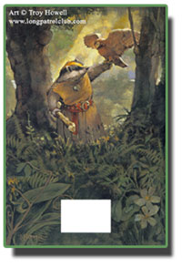
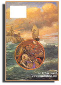
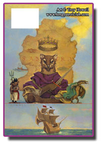
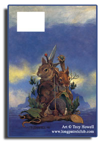
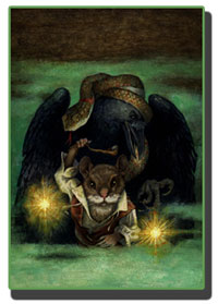
For more than twenty years, Troy Howell has been giving us an almost annual glimpse into the world of Redwall Abbey. Due to the sheer amount of time he's been associated with the series, outside of Brian Jacques, his perspective on Mossflower country is one of the most influential and definitive, shaping the opinions of countless new readers. Making wonderful use of earthtones and producing some of the most striking compositions of the series (especially on the early back covers, some of which can be found below), Troy Howell's covers never disappoint.
Troy graciously took the time to answer some questions about his long association with Redwall and give us a glimpse into his unique perspective. I'd like to express my heartfelt thanks to Mr. Howell for granting us this interview! His website, Studio Ambidextrous, can be found here.
Hope you enjoy the interview!
Martin (The Long Patrol): First of all, thank you for taking the time to answer a few questions! Most of us Redwall fans are only familiar with your work for the Redwall Series. Could you tell us a little about yourself and what other projects you've worked on over the years?
Troy Howell (U.S. Cover Artist): I have been writing and drawing since childhood. My career as an illustrator began with Cricket, a children's magazine, as soon as I graduated high school. From that time on, I've illustrated numerous book jackets and several picture and chapter books. Some of the recent chapter books are Mary Pope Osborne's collection of myths and legends. Currently, I'm painting a mural for our local library. I am also still pursuing writing and hope to publish my own stories soon.
 Martin: Have you always wanted to be an artist?
Troy: Always. More important, though, I've always wanted to respond creatively to life itself. It's a matter of attitude or vision; it's who I am.
Martin: What advice would you give to someone who wants to be doing what you do one day?
Troy: Work hard at it. Learn all you can. Explore your potential. And draw, draw, draw, while you look, look, look. What do you respond to visually? Let that be your guide.
Martin: You've been involved with Redwall since its debut twenty years ago, making you the only artist who is still working on the series that was there at the beginning. What was your initial impression of it and how has that impression changed over the past twenty years?
Troy: I remember the moment I was given the first manuscript of the first book, Redwall, in my editor's office in New York. This was something I hadn't done before, and I was excited. I remember being impressed with Brian's descriptive writing. It was packed with illustrative possibilities! As the series grew, I tried to keep the covers fresh by trying different things compositionally. My goal for each one was to capture the mood or essence of each. As the design format changed--namely the typography--my approach changed with it. It became more of a challenge. I'll address this issue in detail later.
Martin: What has been the biggest surprise while working on Redwall?
Troy: Not a surprise, but a disappointment, due to the changing terrain of publishing. It's not simple any more. Now, there's a high degree of paranoia involved on the publishing end, and as a result the artwork is micro-managed. It's hard to stay inspired under those conditions. But I still push for what I believe will work best for the book.
Martin: How much work goes into creating a new cover? How much time does it typically take from start to finish?
 Troy: In the early years of this series, it was a matter of presenting a concept, getting approval without a lot of back and forth, and painting the finish. Now, I may have to create ten or twenty sketches before all parties involved (editor, art director, author, marketing people) are convinced I'll do it right. That process could stretch over a month or two. Once it's approved, or I say enough is enough, let me do the art, it may take three to five days to complete it. Troy: In the early years of this series, it was a matter of presenting a concept, getting approval without a lot of back and forth, and painting the finish. Now, I may have to create ten or twenty sketches before all parties involved (editor, art director, author, marketing people) are convinced I'll do it right. That process could stretch over a month or two. Once it's approved, or I say enough is enough, let me do the art, it may take three to five days to complete it.
To back up, I have to read the manuscript first--400 pages or so--taking notes, underlining scenes, descriptions, details, making rough sketches. Then I spend time developing my ideas. Usually, one idea shines strong in my mind, and that's what I finally go for.
Martin: What utensils do you use?
Troy: I use acrylics on 100% rag board, with brushes varying in width from an inch and a half to a small detail point.
Martin: How much outside input do you receive for the covers? Are there directions from Brian and the publisher or are you given a manuscript and allowed to pick what you want to draw? I ask because some fans have noted that from 'Outcast of Redwall' through at least 'Triss', both your covers and the United Kingdom covers have depicted the same dramatic scenes (allowing for some artistic interpretation differences), which seems far too many to have been mere coincidence.
Troy: The fans are right: it's not coincidental. Brian writes a detailed description of what he wants. The editor is obligated to give him first consideration. Sometimes I agree with Brian's idea, but usually do not. That's my challenge (see previous answers)-- to visually convince everyone that something else would work better. As a result, I spend more time and make less money, but in the end, I'm satisfied it worked.
Martin: Which of your covers would you say you were the most pleased with?
Troy: The ones that were my ideas. That may seem pompous, but I do my best work when I'm directly inspired from the text, rather than going with someone else's idea.
Marlfox is my favorite. After that, High Rhulain, except that it was placed off-center by the designer. Third, Doomwyte.
Martin: Your early covers followed almost a template of sorts, featuring a landscape with the protagonist shown within a box on the front and the antagonist shown within a box on the back (circles for 'Mariel of Redwall'). With 'Martin the Warrior', though, you started drawing scenes that encompassed the entire cover, which has continued to this day. What prompted this change in approach?
Troy: I wanted to go a more dramatic direction, less static. Early on, I think it worked, but as the market intensified, the covers needed more drama. Also, I had more room in which to play around with images and design.
 Martin: How has the rebranding of the books (as of 'Outcast of Redwall') to include Brian's name in large letters at the top of the cover, in addition to the space eaten up by the title itself, affected your work? Martin: How has the rebranding of the books (as of 'Outcast of Redwall') to include Brian's name in large letters at the top of the cover, in addition to the space eaten up by the title itself, affected your work?
Troy: Try getting an important figure and scene in a five inch square, and you'll see. On the other hand, the limits have forced me to be simpler with my shapes and values, which makes for a stronger, visually easier to read cover.
Martin: The past three books, instead of featuring your artwork on the back cover, have instead featured a picture of Brian. This has been disappointing, as the back artwork is among my favorites (the back of 'Marlfox' was beautiful). Is it absent because you didn't draw anything for them or is it purely a marketing decision?
Troy: This is all about Brian. I don't know who made the decision, but as an author becomes more successful, the author's presence is quite a draw. Yes, I miss the opportunity to include more in the art.
Martin: Is there any chance of seeing the back cover art return for some future book?
Troy: I doubt it.
Martin: You've drawn (by my count) more than sixty Redwall characters over the years, some multiple times. Have you found yourself growing attached to any of them?
Troy:Martin and Matthias.
Martin: How difficult is it to draw the various species that Brian uses? Are you able to draw some quicker than others? Do you have a favorite?
Troy: I enjoy drawing all of the animals. Getting them into their clothes is another matter. And it's a challenge sometimes trying to get their paws to hold things, and to create the right expression without getting melodramatic. Sometimes I draw from life--mice, rabbits, sea otters.
Martin: Conversely, do any make you groan, "Not another!"?
Troy: Um ... come to think of it, otters are the hardest.
 Martin: Your job description for the Tenth Anniversary Edition was somewhat different than usual-- in addition to the cover, you drew six full-page color illustrations, three black and white "Book" illustrations, and a new map. What was the experience like and how did it stack up to your traditional cover work? Martin: Your job description for the Tenth Anniversary Edition was somewhat different than usual-- in addition to the cover, you drew six full-page color illustrations, three black and white "Book" illustrations, and a new map. What was the experience like and how did it stack up to your traditional cover work?
Troy: I loved it. I was illustrating events and action, beyond just characters. I work best in a context. My great disappointment was that they pulled the book after one year, and didn't pursue the idea of illustrating any of the other ones.
Martin: I'm not sure if this is something you can answer, but I've always wondered why the illustration of Matthias crossing the river with the GUOSIM behind him wasn't included with the hardcover release of the Tenth Anniversary Edition. I first saw the piece on the spine of the second audio book release ("The Quest") and finally found it printed in the trade paperback edition of 'Redwall' released a year or two later. What's the story?
Troy: I haven't a clue. I haven't even seen the edition you're referring to. But thinking about that particular illustration, it's the least interesting of the bunch. Perhaps the budget allowed only five to be reproduced.
Martin: We've got another Anniversary Edition coming out later this year, now celebrating 20 years of Redwall, and you once again provided the cover art. Adding a touch of continuity, you drew Matthias in the same pose you used on your previous two covers for 'Redwall' (albeit switching sword paws from the original). However, this time we see him from a new perspective. What prompted this choice versus, say, illustrating an entirely new scene?
Troy: That was strongly suggested to me by the editor. We agreed together that it needed to look celebratory.
Martin: It's been previously reported that you weren't asked to produce any new artwork for the 20th Anniversary Edition beyond the cover (which I think is a real shame). Imagining for a moment that you had, which scenes would have been your top choices to illustrate this time around?
Troy: I'm sorry, I'd have to immerse myself in the story again to answer that question, and I just don't have time. However, I would have leaped at the chance of doing it.
Martin: Still working off a "wishlist" mindset, which of the books (besides 'Redwall') would you most like to produce an Anniversary-styled Edition for one day?
Troy: The most recent, Doomwyte. It has some great scenes.
 Martin: Ten years ago, sculptor Julie London created a set of Redwall sculptures largely based on your work (my set guards my hardcover collection). Did you ever have the chance to meet Ms. London and what did you think of the sculptures? Martin: Ten years ago, sculptor Julie London created a set of Redwall sculptures largely based on your work (my set guards my hardcover collection). Did you ever have the chance to meet Ms. London and what did you think of the sculptures?
Troy: We have talked many times on the phone. I think her work is superb.
Martin: Two of the sculptures-- Laterose and Grumm-- were in keeping with the style of the ones based on your covers, but to my knowledge you've never drawn either of them. Did you provide any additional artwork for her to work off of, or was that all Julie?
Troy: Correct, I've never drawn them. She must have used another source or her own abilities, which she certainly could perform.
Martin: Do you have any non-Redwall projects coming up that you'd like us to keep an eye out for?
Troy: I've been writing middle grade and young adult novels over the years, and I'm getting close to having them published.
Martin: Is there anything else you'd like to say before we go?
Troy: Thanks, Martin.
Martin: Thank you once again for taking time out of your schedule to answer a few questions. It's been a real pleasure!
Thanks again to Mr. Howell for taking the time to give The Long Patrol this exclusive interview!
|


